

The Brief
Backyard Brewing approached me with a clear goal: redesign their beer can system. They release new brews frequently, each featuring original artwork from a different illustrator or artist. That artwork is central to their identity, and it needed to remain front and center. However, the branding surrounding it was lacking impact.
Their previous cans relied heavily on the art to capture attention, while the brand itself felt quiet and underrepresented. They were looking for something bolder — something with more presence and personality. Or, in their words, they wanted to feel “bold and badass.”


Approach
While the initial ask focused solely on packaging, it quickly became clear there was an opportunity to give the brand a bit more structure and confidence. So, alongside the new can design, I introduced a light brand refresh — something that could elevate their visual identity without losing the charm and authenticity that makes Backyard Brewing special.
Before developing the design system, I spent time understanding their values. Backyard Brewing is built on principles of community, sustainability, and good beer shared in good company. That ethos inspired the visual direction — one that invites closer inspection, encourages interaction, and reflects the layered nature of their story.


The new can system needed to balance individuality and consistency — giving each beer room to express itself while maintaining a strong and unified brand presence. Here’s how I approached that:
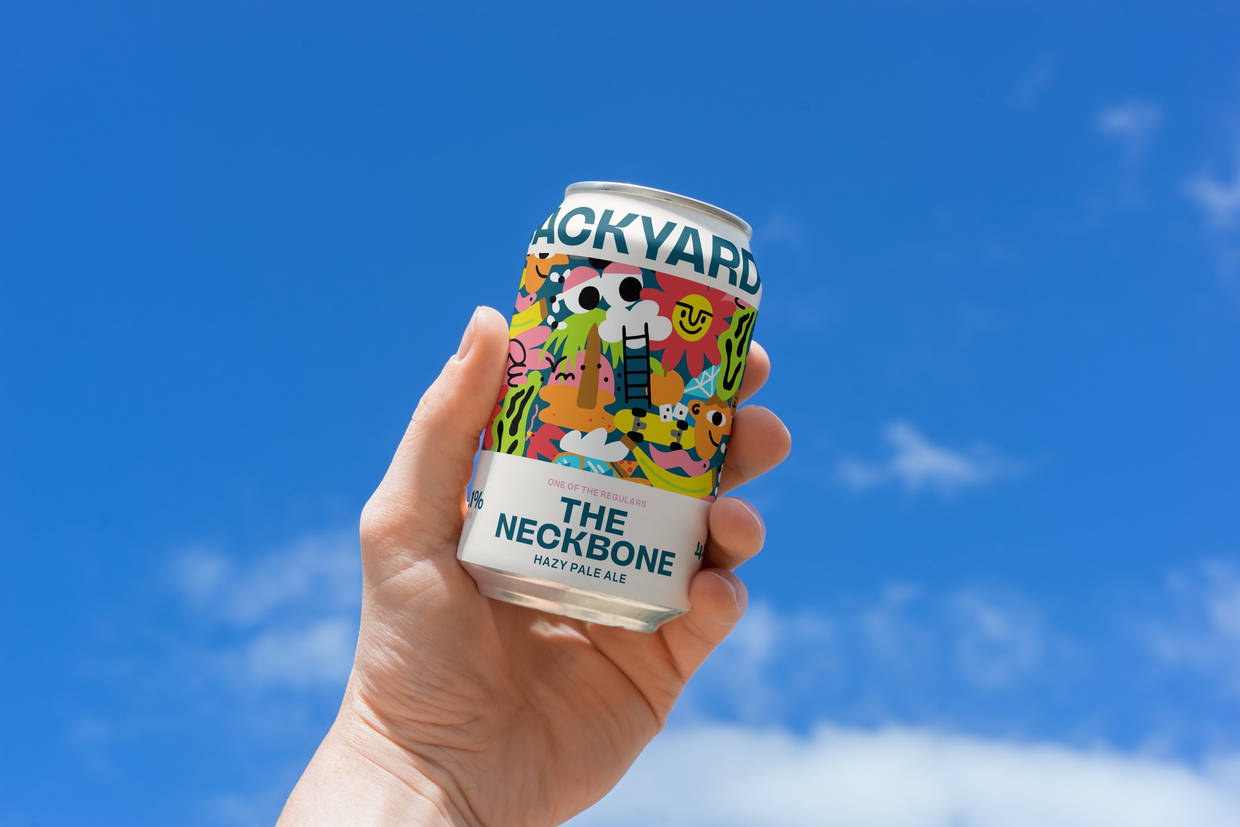
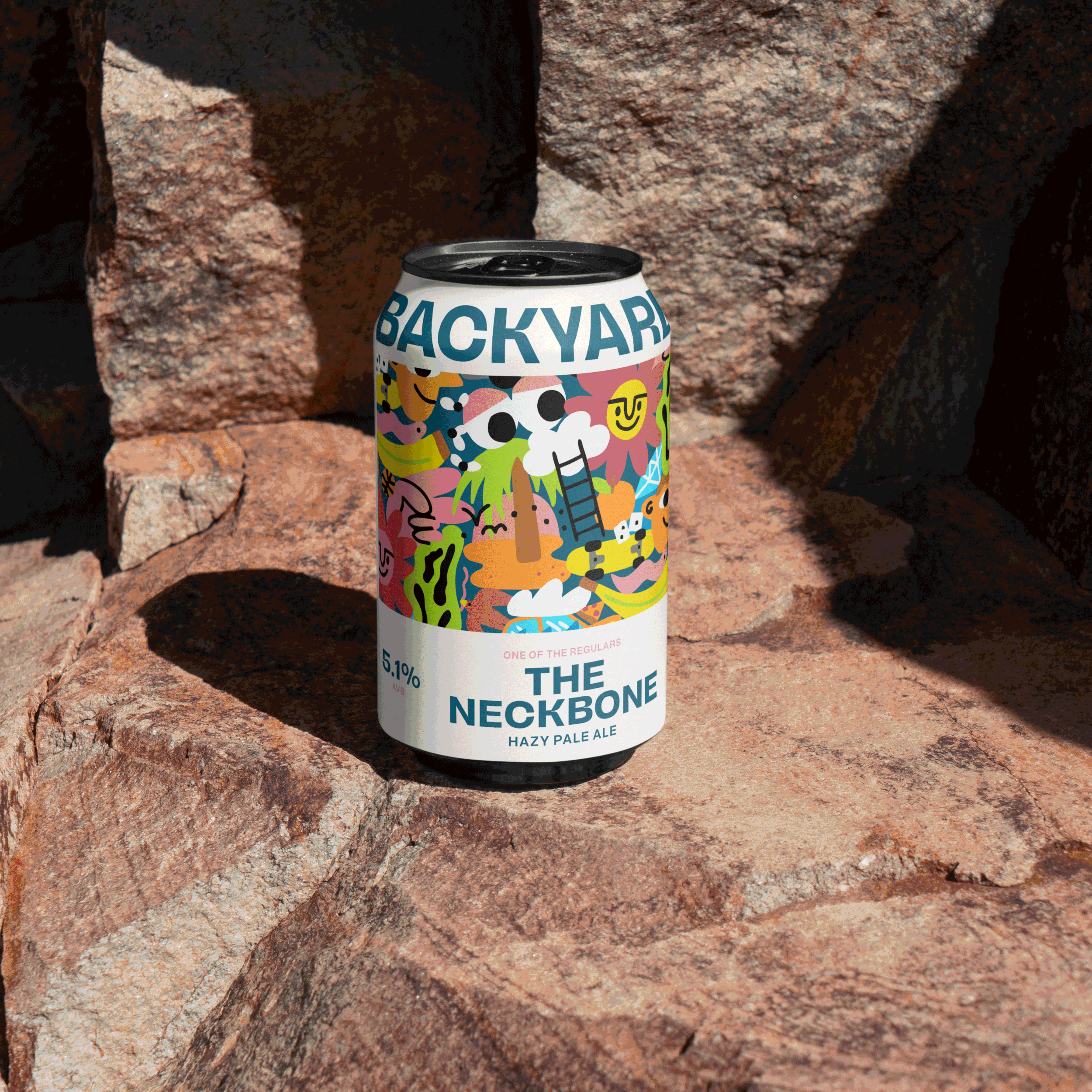
Logo as Structure: The name “BACKYARD BREWING” is positioned prominently, acting as the visual anchor of the label.
Flexible Grid: A clear grid system was designed to house beer-specific details and artwork consistently, allowing variety within a repeatable structure.
Information Hierarchy: A dedicated space beneath the logo keeps all brewery and product information neatly organised, making each can both functional and easy to navigate.
This system gives the Backyard Brewing team the ability to easily update artwork and details for every new release, while preserving visual clarity and cohesion across the range.

Backyard Brewing takes great pride in collaborating with artists for every brew. One of the main goals of this redesign was to build a system that celebrates that. The new layout gives the artwork space to stand out, while the structured framework keeps everything cohesive and on-brand. It’s a system that honours both the creativity of the artists and the values of the brewery.

Outcome
What began as a packaging refresh evolved into a broader reimagining of the Backyard Brewing identity. The final result is a system that’s bold, expressive, and easy to work with — one that showcases the rotating artwork, strengthens the brand voice, and reflects the brewery’s mission in both form and function.
Services Included: