Project Description
When Minna told us they were in the process of making a lightly brewed sparkling tea, we were hooked before we even tried it. When they went on to say they would be donating a portion of their profits to charitable foundations supporting inclusion, we were all in.
From there, we set out to create a brand that would float above the rest in an ever-deepening sea of sparkling beverage options. One that would be as unique and refined as the flavors Minna was brewing up.
From there, we set out to create a brand that would float above the rest in an ever-deepening sea of sparkling beverage options. One that would be as unique and refined as the flavors Minna was brewing up.
Deliverables
• Brand Identity
• Packaging
• Illustration
• Iconography
• Strategy
• Packaging
• Illustration
• Iconography
• Strategy
Rationale
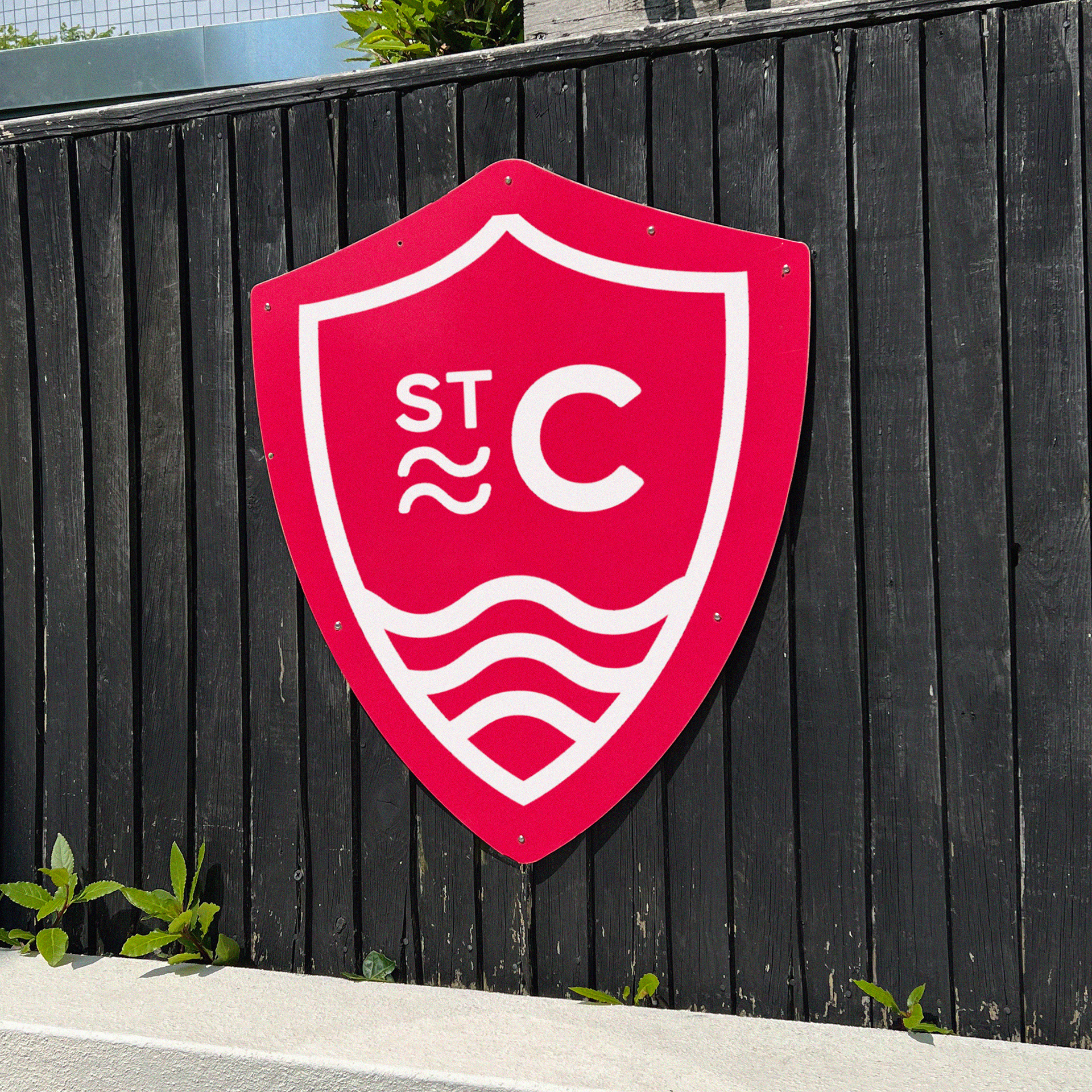
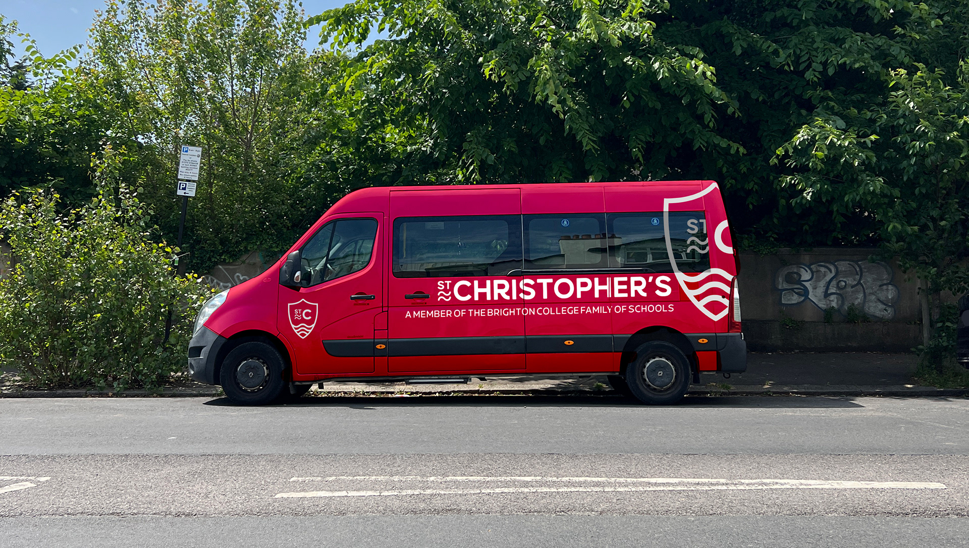
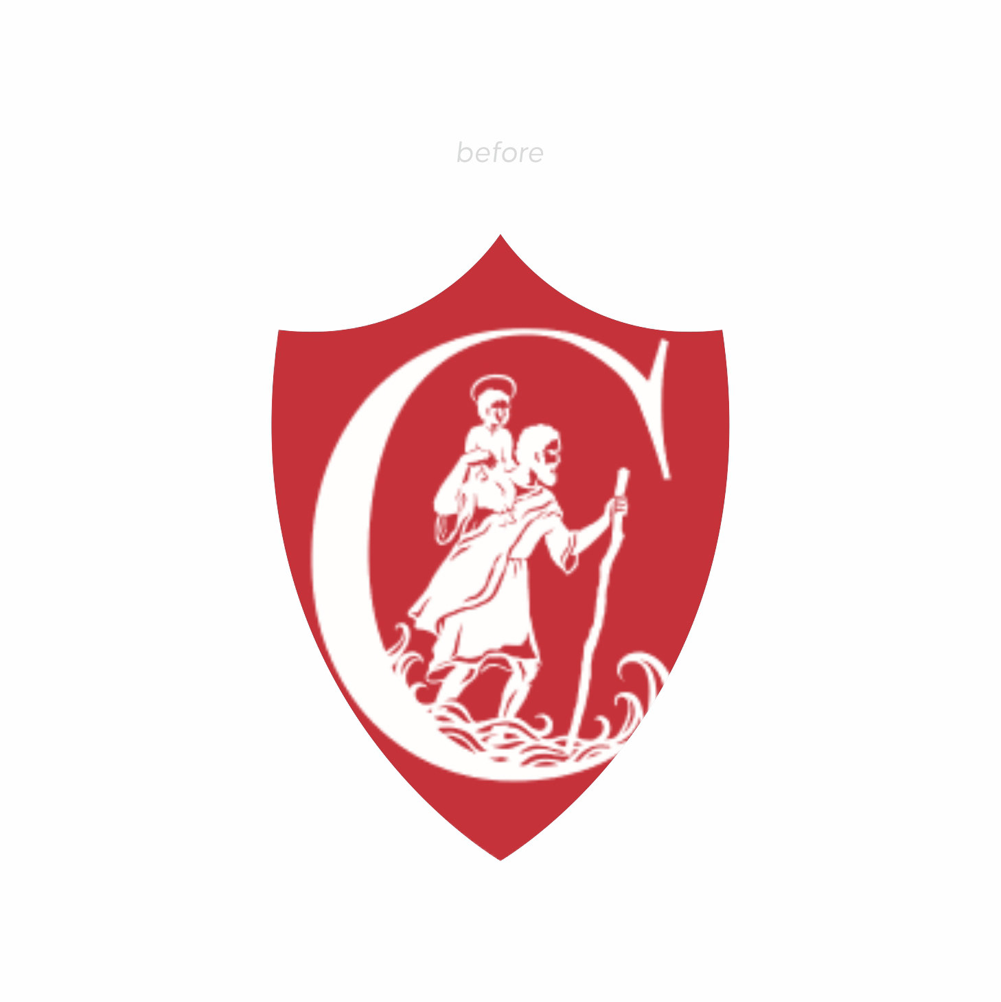
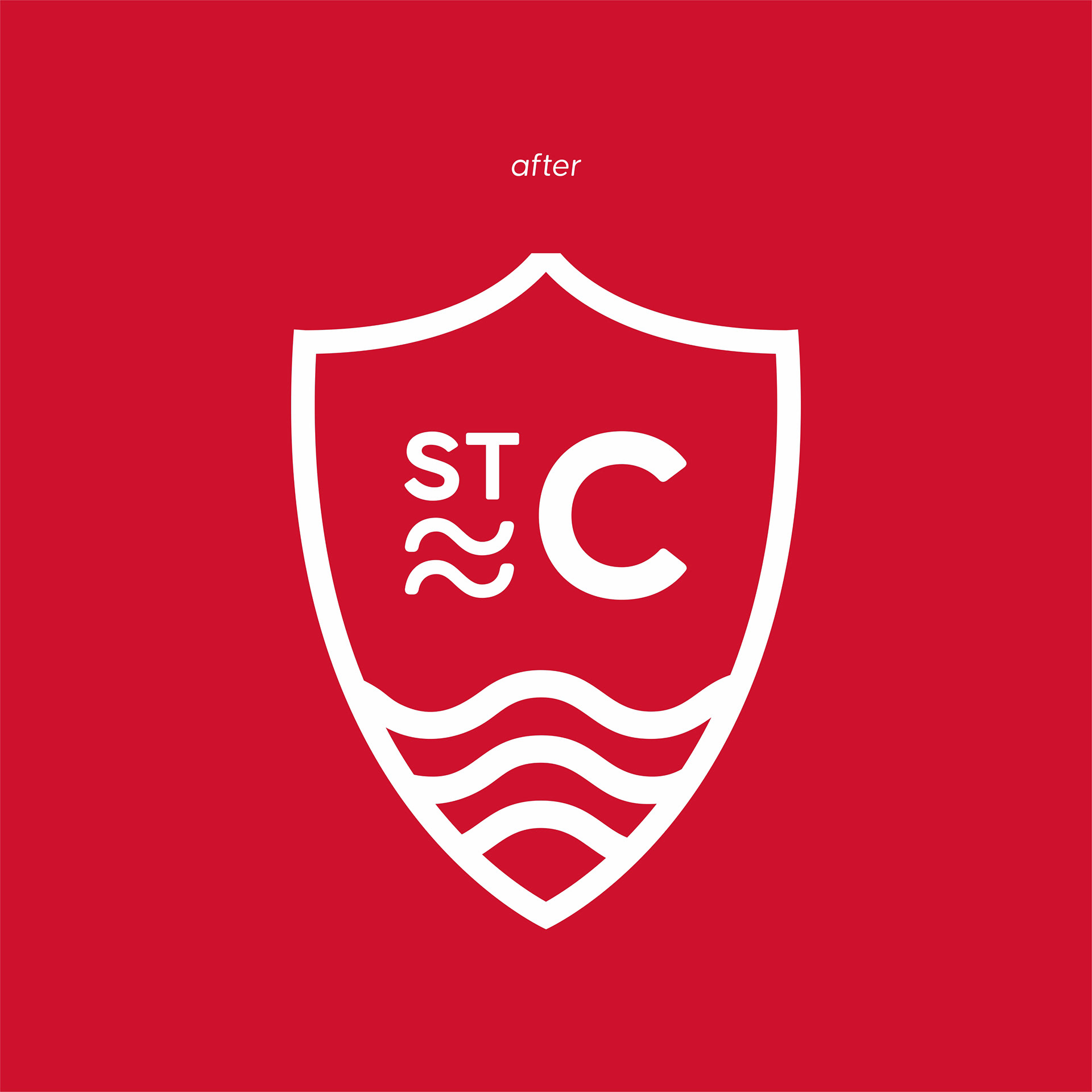
This logo visually conveys what it’s impossible to say outright: with St Christopher’s your
children will be supported. Its lines are minimal and modern, with core symbolism such as the shield radiating out to protect just as St Christopher did and ties with the school providing a safe and neutering environment. Kinetic waves symbolise the stewarding and path being navigated by the school. Much like St Christopher, the mark is artfully crafted, yet with a simplicity that gives it confidence -altogether establishing St Christopher as a brand that seamlessly combines legacy with process.
children will be supported. Its lines are minimal and modern, with core symbolism such as the shield radiating out to protect just as St Christopher did and ties with the school providing a safe and neutering environment. Kinetic waves symbolise the stewarding and path being navigated by the school. Much like St Christopher, the mark is artfully crafted, yet with a simplicity that gives it confidence -altogether establishing St Christopher as a brand that seamlessly combines legacy with process.
Tone
• Sophisticated
• Confident
• Educated
• Modern
• Confident
• Educated
• Modern
Just tea, organic fruit, and some bubbles. We thought the cans should be just as clean and simple.
